
In the fall of 1980, the Lisa got its first pull-down menus. Each window carried its own menu bar along the top. Bill Atkinson, who was building the interface, kept a Polaroid camera next to his computer and photographed every milestone. By about the end of that year, his photos show the menu bar at the top of the screen instead.
The Lisa shipped with it in 1983 and the Mac in 1984. It hasn't moved since. Windows went with the arrangement the Lisa had dropped — a menu bar in every window, under the title bar. Both work. One of them is measurably faster, and the measurement predates the Mac by 30 years.
A law from 1954
Paul Fitts was a psychologist at Ohio State who worked with the US Air Force on flight safety. In 1954 he published an experiment in which people tapped a stylus back and forth between two metal plates as fast as they could, while he changed how far apart the plates were and how wide.
The time came down to one ratio — how far away the target is against how big it is:
T = a + b × log2(1 + D / W)T is the time, D the distance and W the width of the target along the line of movement. The constants a and b are measured for a given person and device. This is the version proposed decades later by Scott MacKenzie, a prominent researcher in human-computer interaction (HCI). Fitts's original differs in detail, not in what it says.
In plain terms, only the ratio matters: a 20-pixel button 200 pixels away takes as long to hit as a 40-pixel one 400 pixels away. And the time follows the logarithm of that ratio, not the ratio itself. Every doubling of the distance adds about the same small step, so a target twice as far away is slower to hit, but nowhere near twice as slow. Bigger and closer is faster, and each can pay for the other.
The law held up for the mouse too: in 1978, a study at Xerox PARC found the mouse faster than a joystick or cursor keys, with pointing times that followed Fitts's law.
Infinitely tall
A screen has edges and the pointer can't leave it. Throw the mouse up as hard as you like and the pointer stops on the top row of pixels — which, on a Mac, is the menu bar.
In Fitts's terms, the menu bar's height along the line of movement has no limit. W goes to infinity, the logarithm goes to zero and all that's left is a, the fixed cost of moving at all. There's still some aiming left and right, but the vertical part of the movement needs none.
A menu bar inside a window gets none of that. It's a thin strip between the title bar and the content. A pointer moving fast enough to get there quickly is moving fast enough to fly past it. The hand has to slow down, aim and stop — the part Fitts's law charges for.
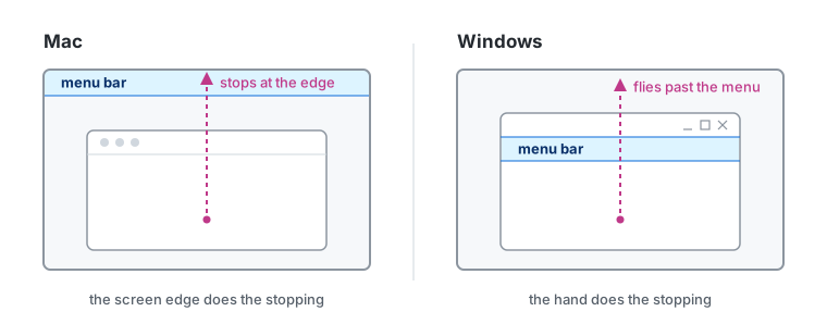
Menu bar vs window menu
Four corners
Where two edges meet, the target is unlimited in both directions. That makes the four corners the easiest pixels on the screen to hit: no aiming at all. On a Mac, the top-left one opens the Apple menu.
Hot Corners, under System Settings > Desktop & Dock, turn the corners into shortcuts — push the pointer into one and Mission Control opens, the screen locks or the windows clear out of the way. Since Monterey, the bottom-right corner opens a Quick Note out of the box. Mine shows the desktop instead — a habit from the Show desktop days on Windows and Linux.
Microsoft learned the same lesson the hard way. Windows 95 put the Start button in the bottom-left corner, then wrapped it in a thin border that didn't respond to clicks — throw the pointer into the corner, click and nothing happened. A later version removed the border. Office 2007 did the opposite on purpose: on a maximized window, the round Office Button's hit area runs all the way into the top-left corner of the screen. Jensen Harris, who led the design of that interface, named Fitts's law as one of the reasons.
Where the window menu wins
The original Mac had a 9-inch screen, where nothing was ever far from the top. On a 27-inch display, a window in the bottom half is a long way from its own menus. The logarithm softens that distance. It doesn't erase it.
Then there's the question of whose menus they are. The menu bar belongs to the active app, not the window under the pointer, so with two apps side by side, reaching the other one's menus takes a click on its window first. A menu bar inside a window never has that problem — it's attached to the thing it acts on.
More displays made it worse. For most of its history, the Mac had one menu bar, on the main display, so a window on the second screen kept its menus on another screen entirely. OS X Mavericks fixed that in 2013 by giving every display its own.
And an edge only works while it's an edge. My Dell stands behind the MacBook, but in System Settings > Displays it's arranged to the right of it, so the top of both screens stays a wall. Arranged above — closer to where it actually stands — it would turn the MacBook's menu bar into a doorway: the pointer would sail straight through it into the Dell.
On the web
A page gets none of this for free. It rarely touches the edge of the screen — the browser's own toolbars sit above it and usually the Dock or a taskbar below — so a web app has no edges and no corners to work with. What's left is the other half of the formula: size and distance.
Size is the easy one, and a checkbox is the best example. On its own, the target is a small square. Wrapped in its <label>, it's the whole line: a click anywhere on the text toggles the box, and nothing on the screen had to get bigger. WCAG 2.2 set a floor in 2023: at level AA, a target should be at least 24 by 24 CSS pixels, unless it has that much clear space around it.
Distance has the better trick. Bruce Tognazzini, an early Apple interface designer, called it the prime pixel: the one under the pointer right now. A context menu opens there, so the distance to it is zero wherever the pointer happened to be. No edge or corner beats a target you don't have to move to.
Still at the top
When the iPad got real windows in iPadOS 26, it got a menu bar with them — at the top of the screen, revealed with a swipe down or by pushing the pointer against the top edge. More than forty years after the Lisa, a new platform with a pointer ended up in the same place.
The menu bar's look has changed with every era, from the Lisa's black on white to the transparent strip Liquid Glass made of it in Tahoe. Its position never has, because the position was never a matter of style.
The menu bar isn't at the top because it looks right there. It's there because the pointer can't miss it.