
Every OS release ships with a list of things it wants you to notice. Most of my first hour after an upgrade goes into turning those off.
My setup is deliberately unremarkable. Nothing animates that doesn't have to, nothing is translucent for the sake of it and the wallpaper is dark enough that I forget what it is. This isn't minimalism as a personality — it's that an interface I have to read through is an interface that's costing me something. When Liquid Glass landed in Tahoe, that cost went up. A year of refinements later, and especially now on macOS 27 Golden Gate, it's finally negotiable.
The slider
The single most useful change in Golden Gate isn't a feature. It's a slider.
Tahoe gave you a look and a couple of switches around the edges of it. Golden Gate gives you a continuous control over how transparent or opaque the whole effect is, sitting in System Settings > Appearance next to the tinted and clear options. Push it all the way to the opaque end and Liquid Glass stops being glass. Panels become panels. Sidebars stop showing you a blurred smear of whatever is behind them.
Full tinted, slider all the way over. That's the whole configuration and it's the reason this post isn't about how much I dislike Liquid Glass.
What I appreciate about the slider specifically is that it isn't an accessibility escape hatch. Reduce transparency has existed for years and it works, but it's a single switch that opts you out of the design entirely and takes some contrast decisions with it. The slider is the same choice offered as a preference instead of an exemption. Those are different things, even when the end result looks similar.
Show borders
The other setting I turn on immediately lives in System Settings > Accessibility > Display: Show borders.
Liquid Glass leans on transparency and depth to tell you what's a control and what's just surface. That works right up until the thing behind the control has any texture of its own. Show borders draws an actual outline around interactive elements, and on macOS it does exactly what it says — buttons look like buttons, toolbars separate from content and nothing else changes.
On iOS the same setting exists and doesn't land nearly as well. Turn it on in both and open Safari: on the Mac the outlines go where a border belongs, while on iPhone every icon along the bottom bar gets boxed individually. Instead of one clean control strip you get a row of small rectangles fighting for attention. The setting is technically doing its job. It's just producing more visual noise than it removes.
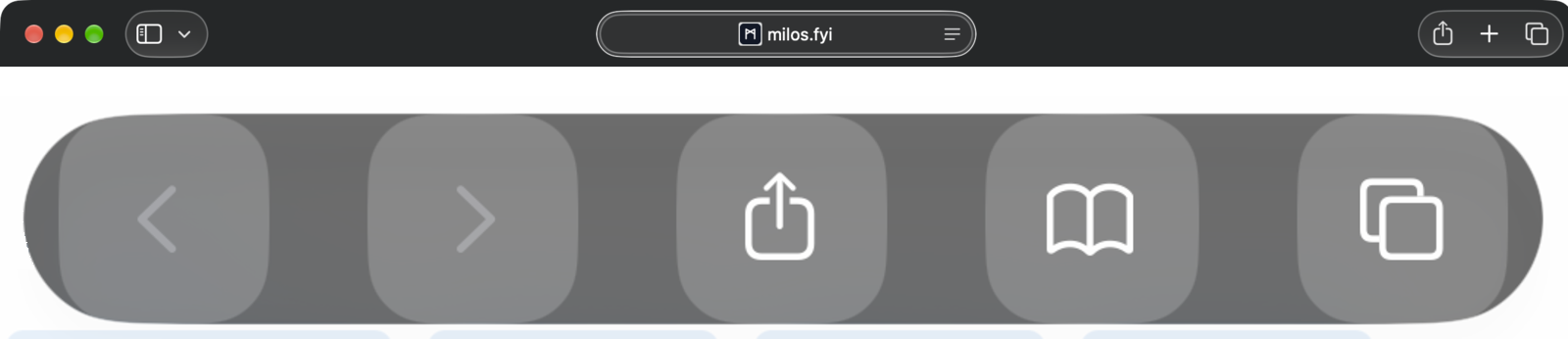
Show borders in Safari — macOS above, iOS below
That gap is the general shape of the thing: macOS gives you real levers over the look, iOS gives you the same switch with less room to be right about it.
The desktop
Three settings, all in System Settings > Desktop & Dock, all doing the same job.
Dim widgets on desktop: Always. Widgets are a glanceable thing, not a thing to look at. Dimmed, they sit behind the work instead of next to it — you see them when you look for them and you don't when you don't. The default only dims them in certain conditions, which means sometimes they're loud and sometimes they aren't. Always is the setting where I stop noticing them, which is the point of a widget.
Stage Manager: off. It solves a window management problem I don't have, and it does it by moving things around on their own.
The Dock stays visible, but with magnification off and Show suggested and recent apps in the Dock turned off so it stops growing on its own. A dock that changes size depending on what I opened an hour ago isn't a dock, it's a feed.
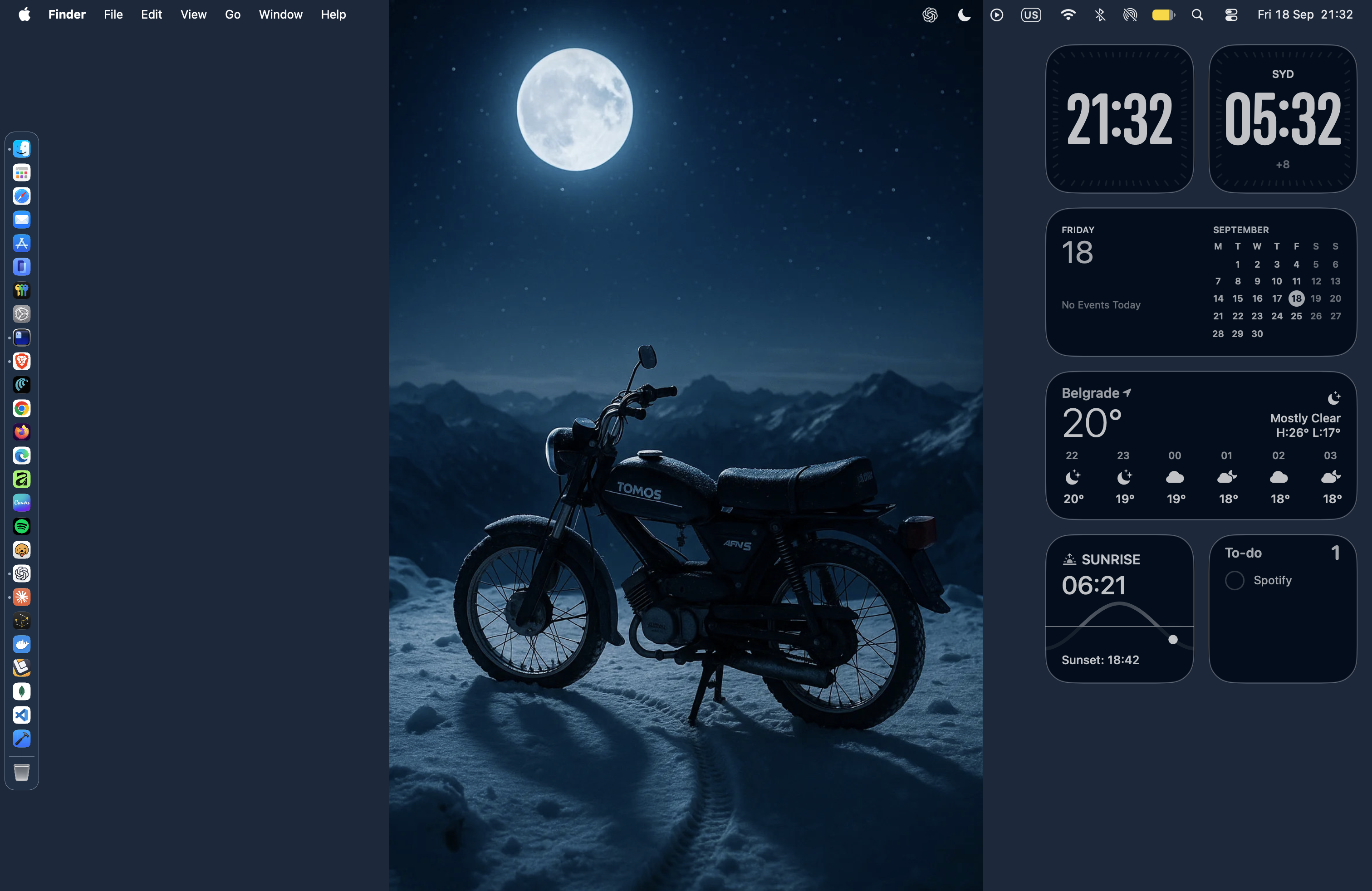
My macOS 27 desktop — dark wallpaper, dimmed widgets and a Dock with no suggested apps
Things I didn't have to change
Some of the improvements in Golden Gate go in the same direction on their own, which is not something I get to write often.
Consistent corner radius. Tahoe made window corner radius dynamic, scaling with what was in the window's toolbar. It looked enough like a bug that Apple had to call out the fix at WWDC. Golden Gate standardizes it. Windows are now the same shape as other windows, which sounds like nothing until you have four of them open and none of them are arguing.
Icons out of the menus. Tahoe put a symbol next to nearly every menu command. The intent was to make menus more scannable; the result was denser menus that took longer to read, because a list of text reads top to bottom and a list of text-plus-pictures doesn't. Golden Gate pulls most of them back out. The same restraint carried over to the menu bar, which no longer leads with icons by default.
The traffic lights. These I was wrong about. The redesigned close/minimize/zoom buttons picked up the glass treatment and a small bounce when you drag them, and on day one it read as motion added to the one part of the window that never needed any. A few weeks in, I don't have a case against them. They're the right size, they're still three colors in the same corner they've been in since forever, and the bounce only shows up when you're already deliberately messing with them. Not everything that moves is noise. I just assume it is until proven otherwise.
The app icons. Golden Gate redesigns them with additional layers that read properly across light, dark, tinted and clear. Tinted mode in Tahoe had a habit of flattening icons into shapes you had to identify by position rather than recognize — and this is where the layering matters, because now there's enough depth left in a tinted icon to still tell them apart at a glance.
This is also the one thing that works equally well on both platforms. iOS 27 doesn't give you nearly as much control over its own appearance as macOS does — Show borders being the clearest example — but the icon work carried over intact. Same layers, same restraint, same result on a home screen as on a Dock.
Boring is the point
None of this is a complaint about Liquid Glass as an idea. Apple built a look, spent a year sanding it down and then — the part that actually matters — gave people a control to decide how much of it they want. That's a better outcome than either shipping it unchanged or walking it back.
I want an operating system I stop seeing. Not because there's anything wrong with an interface having a look, but because every second spent locating a button is a second not spent on the thing the button does. Golden Gate is the first release since Tahoe where getting there took settings instead of workarounds.
The best compliment I can pay a desktop is that I couldn't describe it from memory.